You might have already noticed (after my color branding, SEO Slogans and branding outside SEO) that I’m particularly interested in overall SEO niche marketing and branding recently – well, that’s all because I am just starting promoting my brand and service and so the topic seems new and exciting to me. Today I am going to share my thoughts and observations on SEO logos and banners.
Now what is the purpose of a company logo?
- It gives visual representation of a professional SEO company service/product (and thus accounts for its positive associations);
- It establishes a brand identity (making it unique and memorable).
Most important logo features are:
- trustworthy (<= professional);
- catchy/memorable (<= unique);
- associative/symbolic (=> conveying feelings, and sending a message…);
- matching the overall design;
- clean and functional.
How Can SEO Be Graphically Described?
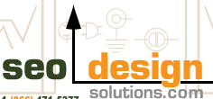
1) It can be represented as ‘growth‘ (e.g. growth in rankings, profit, etc).
Example: SeoDesignSolutions
(Note: I would have made it left-to-right growth though to make look more understandable for US and European people who are believed to think (as well as read) from left to right):

2) Uniqueness (the service that makes you stand out).
Example: SearchEnginePeople:

3) The high quality of the service itself.
Example: a star by AdvanceRankings:

4) High level of professionalism/expertise.
Example: (well, besides myself) SearchEngineJournal:

Except for describing the service itself there are other types:
| Type | Example URL | Example Logo |
| Abstract graphic symbol | Distilled.co.uk |  |
| Unique well branded image | SearchEngineGuide |  |
| Domain/brand Name | ViperChill |  |
Get Inspiration:
- 56 Most Creative Logos – lists great examples to follow.
- Logo collection – another list of creative logos.
