 Recently I have been browsing around looking for some information on copyright infringement and what astonished me was that all I could find was content based .gov, .edu and wiki pages. Copyright and trademark are hot topics now and I am sure many people searching for them are interested in finding a professional consultant service rather than a question-answer thing.
I did manage to find a few “Copyright Lawyer’s” websites though offering help with copyright infringement remedies and trademark registration. What struck me was that those firms lacked professional design and properly optimized landing pages.
Before I refer to the examples, let me first list important components of the landing page:
- Use graphics to stress main elements on your page and compose a clear bold headline = catch your visitor’s eye;
- Try to be brief and keep to the main point = avoid distracting attention;
- Offer something for free (and make your offer urgent) = get the visitor interested;
- Stay on topic both in your design and slogans (i.e. use congruent design elements and consistent statements) = keep your potential client interested;
- Make a clear list of your services = convince your visitor that it is exactly what he was looking for;
- List key benefits of your service = tell the visitor why you are better than your competitors;
- Mind your design: use your brand logo and official looking color scheme = look trustworthy;
- Be personal (e.g. show the “support angel’s” photo or tell the founder’s story) = make friends with your potential customer;
- Use official-looking graphics (e.g. seals) = avoid FUD (i.e. fear, uncertainty and doubt);
- Mind your grammar (e.g. use present instead past tense) = avoid misunderstanding;
- Give your contact info = show you are ready to help;
- Formulate a clear call-to-action (better several of them in key places) = make sure the visitor will take action.

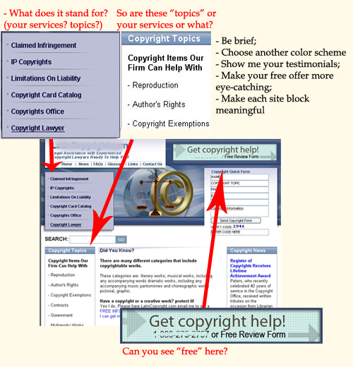
- Be brief: when you want to list your services, tell people these are “services” (not “Copyright Topics”, not “Copyright Items Our Firm Can Help With”, etc);
- Choose color scheme which looks official; hey, you are not selling candies here!
- Show me your testimonials – make me want to believe you!
- Make your free offer more eye-catching; stress that it’s urgent – use “now” for example.
- Make each site element meaningful – the most prominent part here lists some terms with no evident prompts what they stand for. Don’t distract your potential customers’ attention.

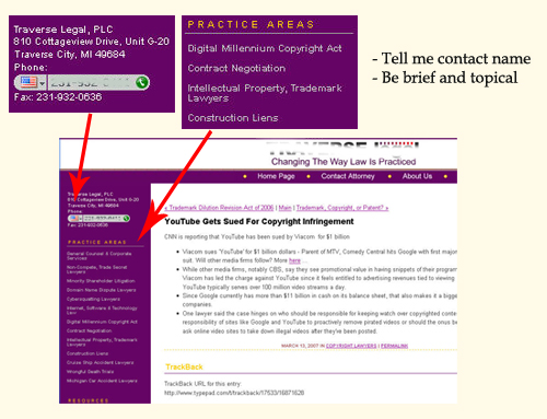
- Be personal – people will trust a name, and add your founding lawyer’s personal story.
- List your services in clear, readable format.
- Add some graphics – there’s nothing to catch my eye at your site!

- Give your contact information on the landing page – don’t make your potential client go to another page to reach you.
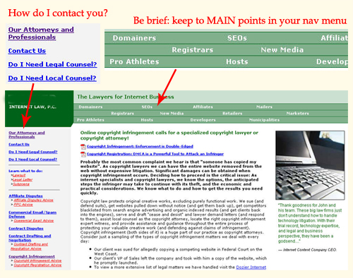
- Navigation menu catches the visitor’s eye, don’t distract his attention. List only key information there.
Further reading: Check this excellent landing page optimization case study by MarketingExperiment.com
