I’ve lately had to deal with a huge database-driven website. What troubled me most was the huge navigation menus – and I am wracking my brain over the ways to optimize it both for users and search engine bots. It is always the hardest – to organize huge number of links into one easy-to-navigate and clear menus.
I am researching the topic now, drawing the site structure on a sheet of paper and still have to come up with the “perfect” solution.
Now, the best way to educate yourself is to learn from examples. Therefore I decided to look into one of the most successful (in terms of performance, not implementation) examples dealing with the huge database of products and sections: Amazon.com
Below, I am giving the history of Amazon.com navigation menus evolution without going into any extra ramblings. Your thoughts, resources and opinions are much appreciated! I promise to do a follow-up here or at SEJ linking to everyone whose comments I’ll be referring to!
I’ll start my analysis from 1999 when Amazon sidebar navigation looked overwhelming to say at least:

The key features:
- Website sections sorted into first- (bold links) and second-tier (“… And More” section – containing all things that can’t be combined – is a good sign of broken website information architecture) ;
- Inconsistent website navigation: why do “Top Sellers”, “Recommendation Center”, “New Releases” and “Soundtracks” come in one pack?
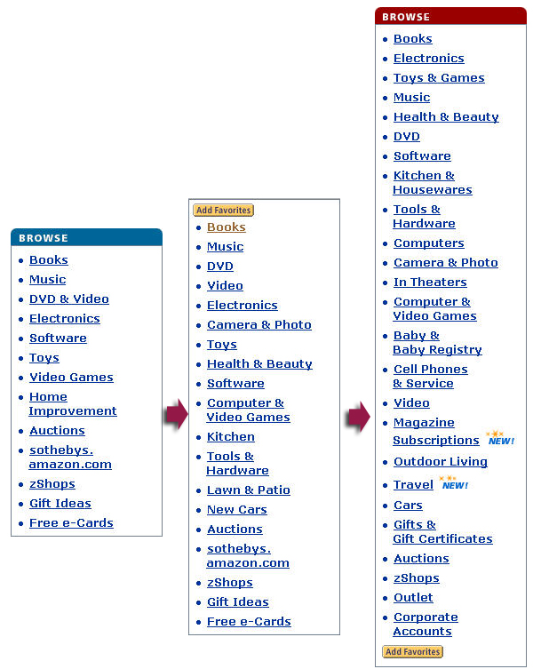
In 2000 Amazon took some steps to make the navigation menus much shorter (the image below) – second-tier levels were removed. It might be much more focused that way and less disturbing but does provide much less information for the first-time visitor.
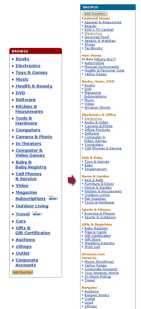
During the whole next year it remained still top-tier-only but it continued to grow until it turned into something surprisingly huge and even more unfocused. Most elements seem to be completely in the wrong place: Video and DVD? In Theaters? Magazine???

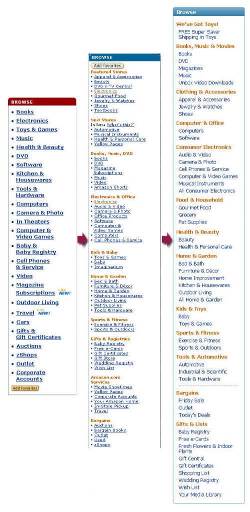
It had remained to be that huge monster until 2006 when they changed the design twice again: first time it turned into something even larger and clumsier (with second level being back):

And then into something even huger but surprisingly much better organized (click to enlarge):
Positive steps in information organization:
- Main categories are listed in alphabetical order;
- Categories and subcategories are all logically related (e.g. there’s no more “Top Rated” and “Soundtracks” listed under one roof).
As of today (January 2009) Amazon sidebar navigation (hover) menus contains even more links (screenshot from Google cache to get an idea how it looks like with JavaScript disabled):
The first thing that comes to my mind is that they renamed the whole block from unclear “Browse” to “Shop All Departments” (which is already a good move).
Secondly, they have reconsidered the alphabetical order and probably list them by popularity now (I guess popularity was also the criteria behind re-arranging the subcategories).
So, what do you think on the whole topic of arranging links into the navigation menus? Any tips links observations to share?
Post image by flattop341


