 Sharing visuals on LinkedIn isn’t as easy as some of the other platforms.
The visual has to be sized perfectly, and most of the time LinkedIn compresses the visual into a blurry mess.
Plus posting infographics is almost impossible!
Now when you share a ton of visual content like Venngage, that quickly becomes a problem.
So this past summer I decided to try something different on our LinkedIn page.
For each of our most popular blog posts, I created a very simple presentation or slide deck. Like so:
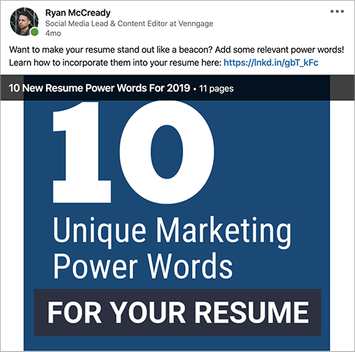
And that shift lead to 10x impressions almost overnight.
Our shares went from a handful of likes and impressions to trending on LinkedIn in just a few weeks.
After hearing those stats, I bet you want to learn how to create your own simple presentations.
So let’s get started!
Table of Contents
1. Pick the right blog post or content
Selecting the right piece of content for one of these simple presentations is very important. You don’t want to spend all this time designing something that no one wants to read.
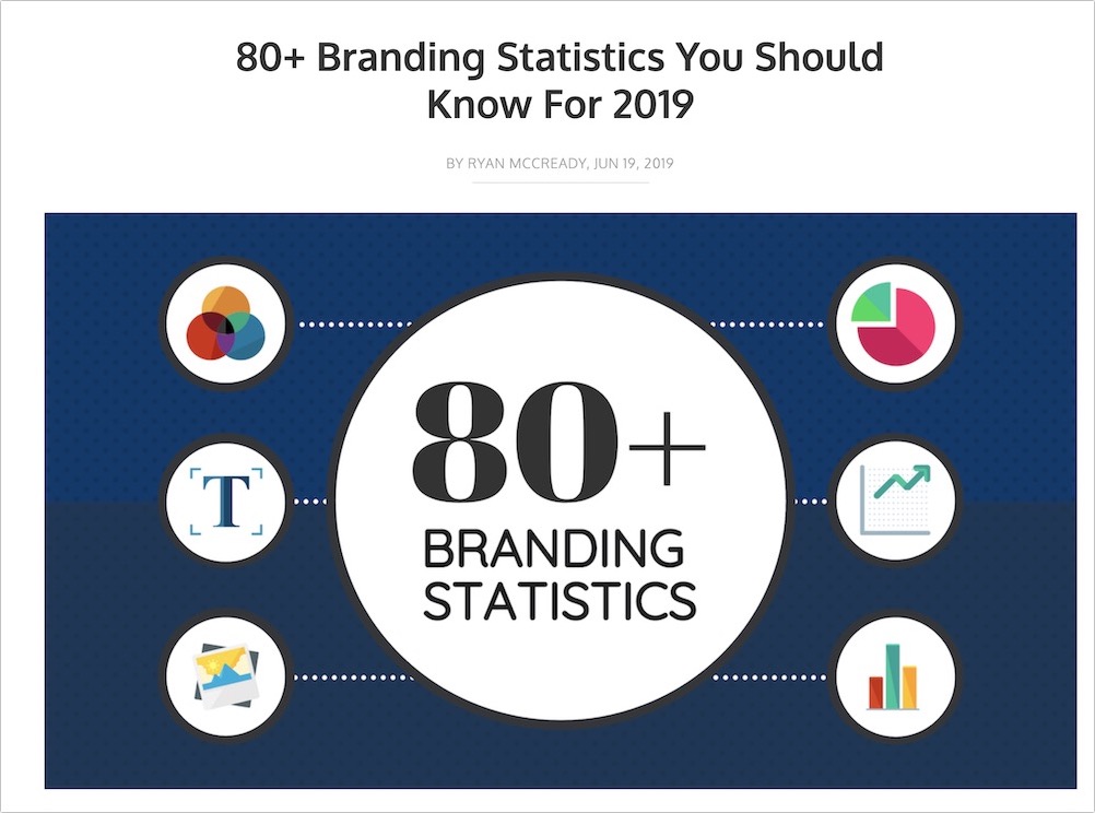
You can pick content that is extremely generic and popular across LinkedIn, like branding stats.
Or something very specific to your niche, like how to conduct a SWOT analysis.
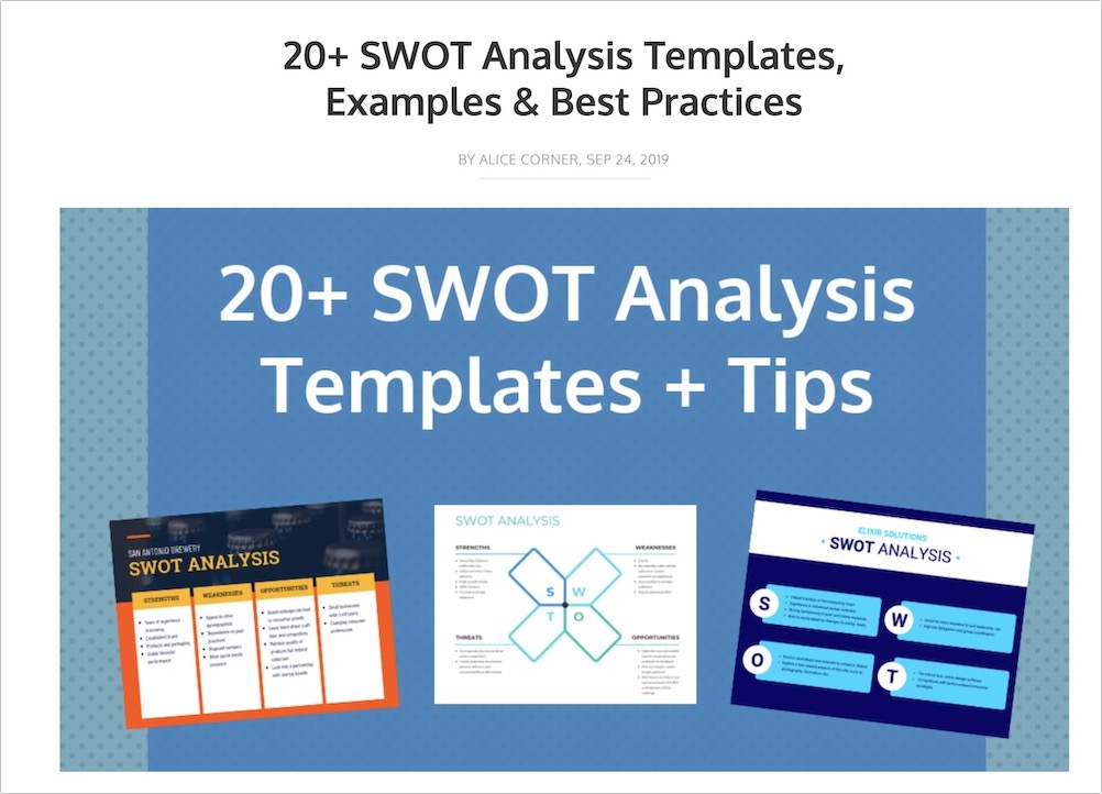
Honestly, I have seen both types of content work extremely well on LinkedIn. Just make sure the content is easy to consume in a few seconds while someone is scrolling through their feed.
Now there are a handful of blog posts and content that work best for simple presentations including:
- Simple lists
- Step-by-step guides
- Expert quotes & stats
- Checklists / to-do lists
- Infographics
These examples can easily be broken down into smaller chunks of content and read on any device.
In the presentation below, I simply used a list from our marketing plan guide for each slide:
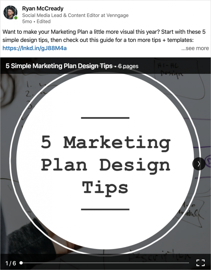
I like using this approach because it gives the reader just enough to pique their interest, and if they want to learn more they can read the blog post!
You can even use information that is adjacent to your content. For example, for a blog post about using font correctly, I created a presentation that listed the top 10 most used Google Fonts.

Unsurprisingly this was one of the most popular presentations that we shared, and it ended up trending on LinkedIn. I mean who doesn’t love fonts?
So just remember before you start creating a LinkedIn presentation, make sure you have picked a suitable piece of content.
2. Extract only the important information
I have seen a lot of people ruin their simple presentation by skipping this step and including way too much content.
Some people share a presentation or a full document full of information directly on their feed.
It’s important to remember that this will be shared on a social media site, people aren’t want to read a ton of information.
They want bite-sized pieces of content that they can quickly read and decide on if they want to learn more or not.
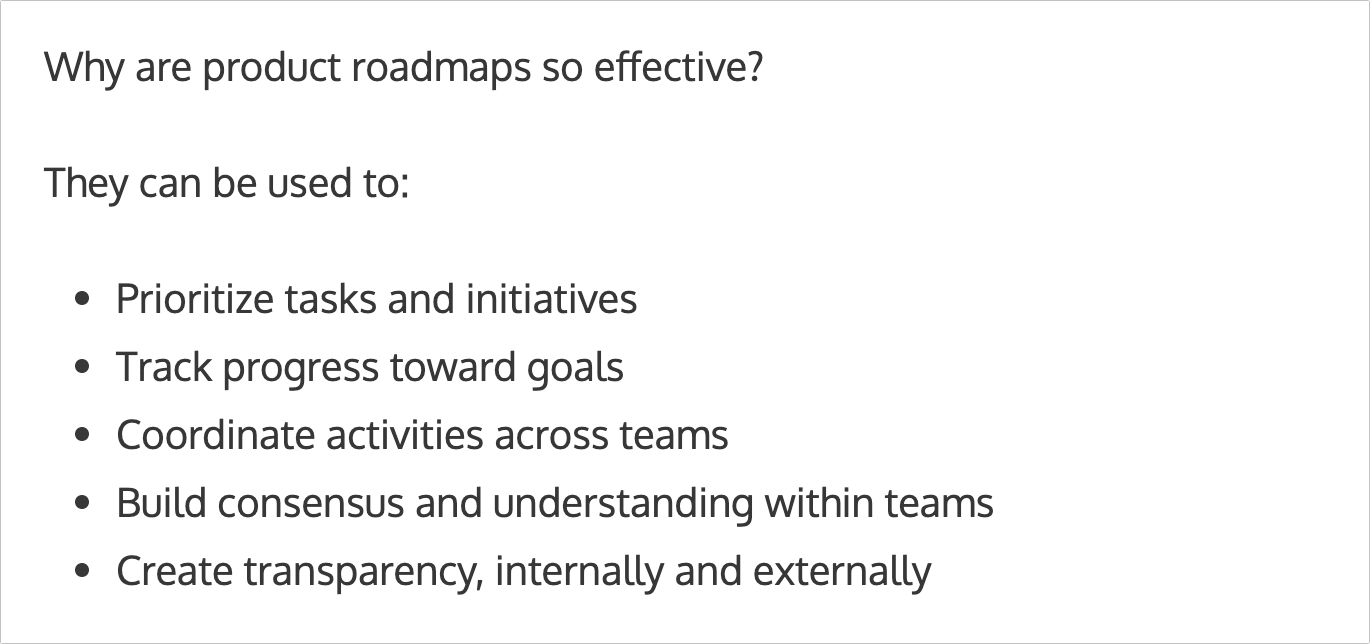
Try to find lists:
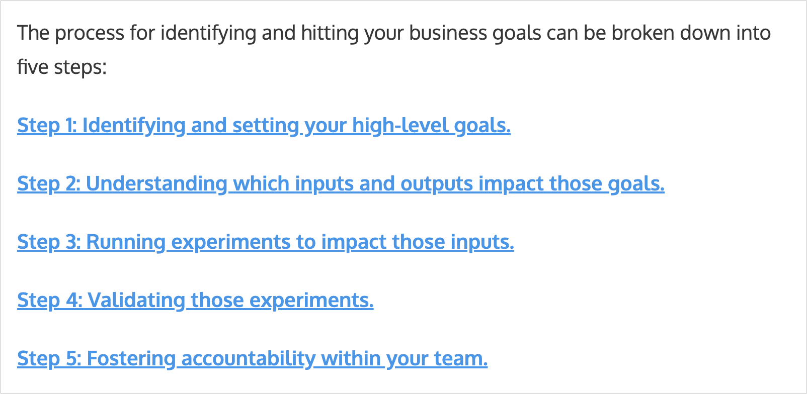
Step-by-step guides:
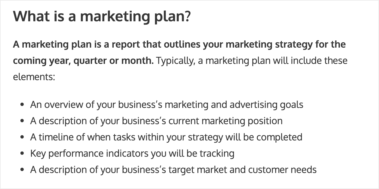
Definitions:
Expert quotes:

Facts or statistics:

Graphs, charts and data visualizations:

And more! Try to find things that are either actionable, interesting or helpful in your content and you will be set.
However, before you start designing your presentation, you will need to clean up the information a little.
I would recommend condensing each point or idea into just a few words and cut out any unneeded content. For example, I condensed the content from this list:
Into simple phrases for each slide of the presentation:
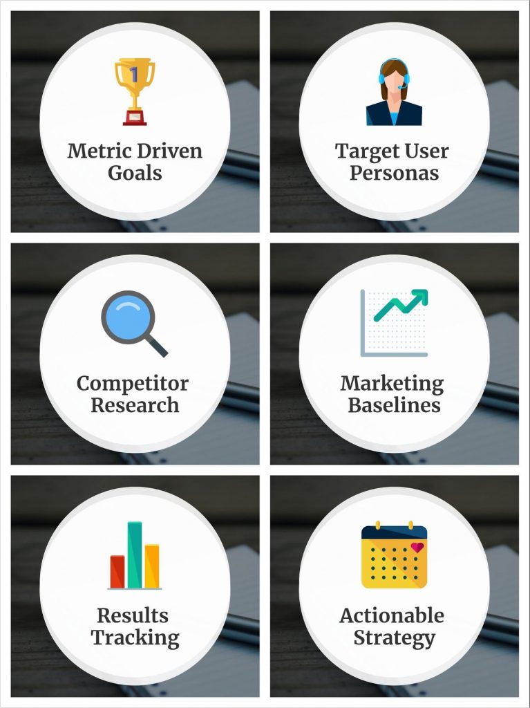
In fact, the more content you choose to include, the smaller the font must be on each slide. So consolidating and cutting content from your outline will ensure its easy to read, no matter the device.
Plus, it will help you keep a consistent layout throughout your slides!
3. Select an easy to edit template
At Venngage we have hundreds of great presentation templates, but for this project, I would recommend selecting one of our Instagram templates.
There are a few reasons for this but the main one is that a square presentation takes up more screen real estate. And when someone is furiously scrolling through their feed, that will make a big difference.
Plus you can easily repurpose this content for Instagram or other social networks.
Thankfully all of our Instagram templates are super easy to edit and can easily be converted into a presentation with multiple slides.
There are a few formats that I have tested but the most successful templates include an eye-catching icon with open space for the text, like so:
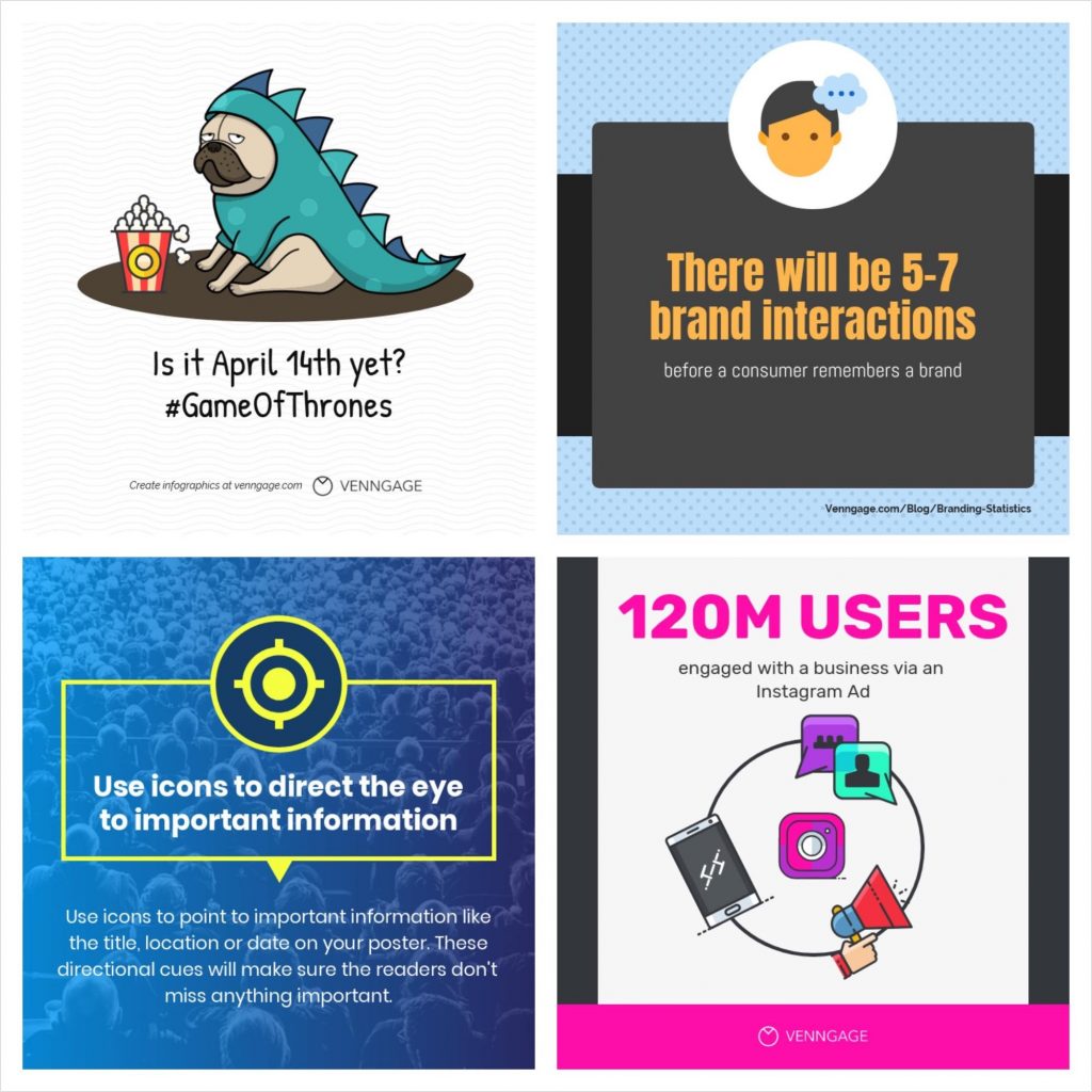
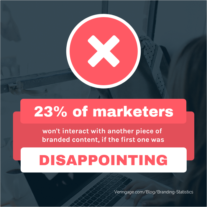
If you’re working with stats or facts, a template like this could be used effectively as well:
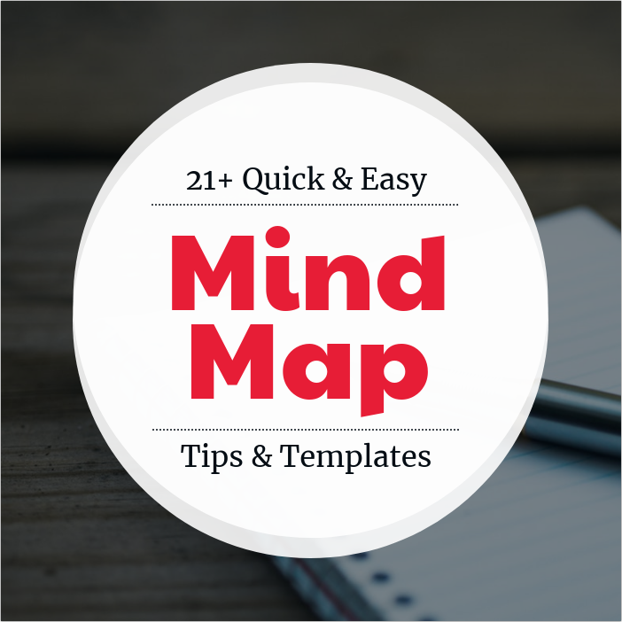
A template with a strong central focal point, like below, is another great option.
Each of these templates can be edited in seconds to fit your topic or brand. Check how I used the template above to create this presentation about a marketing plan:
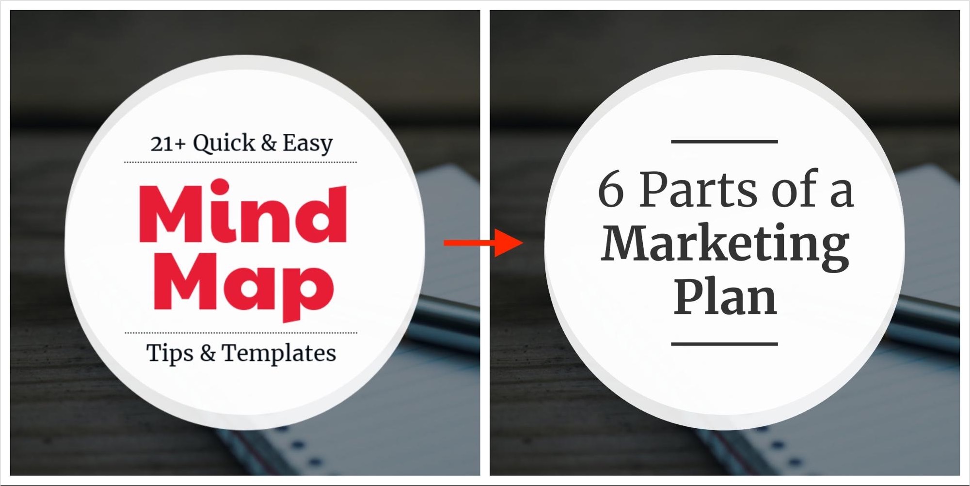
As you can see, because of the strong template layout I really didn’t have to change much to create an interesting presentation.
But enough talking about making one, let’s actually create your LinkedIn presentation!
4. Make sure you have a title slide
Creating an eye-catching title slide should be the first thing that you do after picking the perfect presentation template.
That slide is going to be the first thing a reader or follower sees in their LinkedIn feed, so make it count.
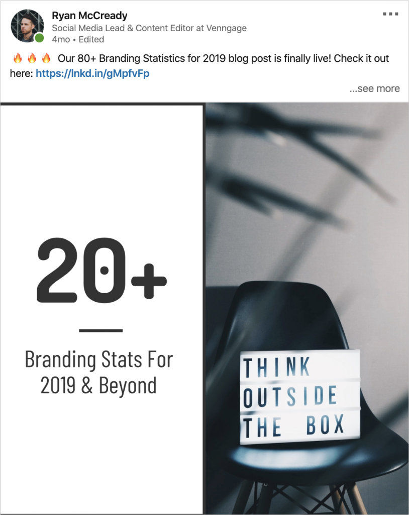
The title slide really doesn’t have to be anything special, just be sure that it’s descriptive. As you can see in the example below, I used a well-designed but relatively mild title slide:

This slide tells the reader exactly what they are going to see in the presentation, without being obnoxious or overwhelming.
I would recommend only including the title of your presentation and a simple visual, like an icon or unique photo on the first slide. Anything else will just be a distraction.
That said, a simple stock photo does make a great background and will add some texture to your presentation as well!
Here are a few more examples of well-designed title slides:
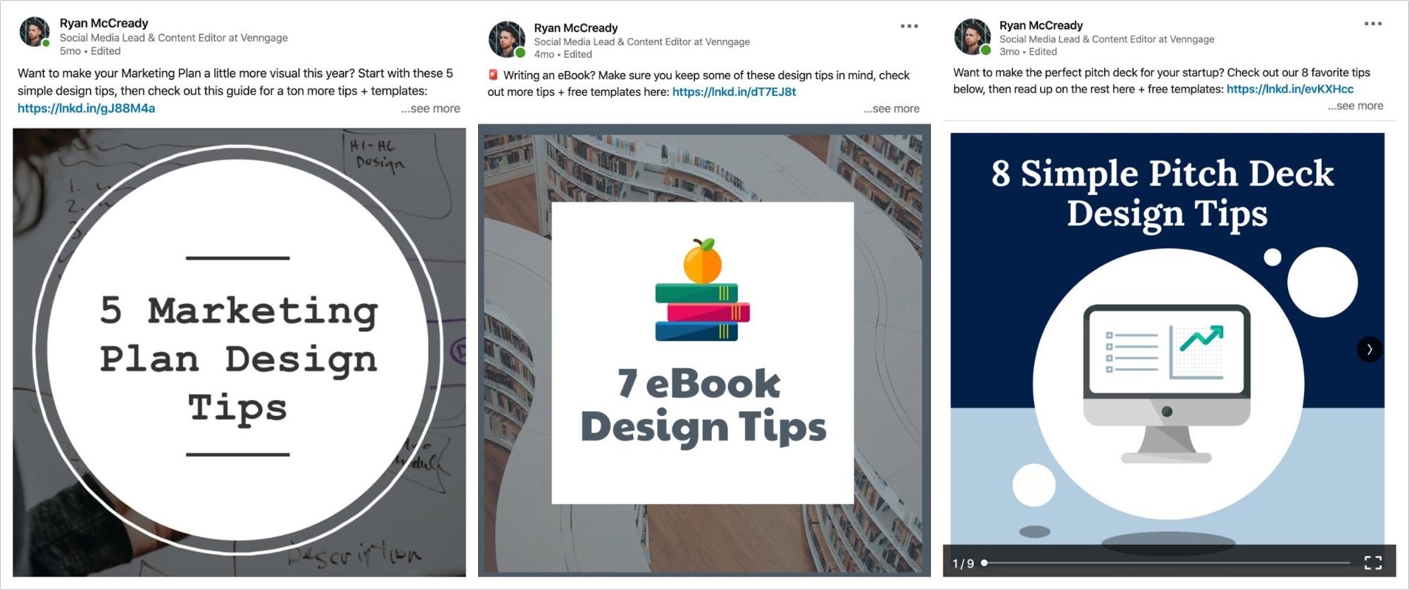
These will definitely stick out on LinkedIn!
5. Add one idea or point per slide
Now that you have created your title slide, I would recommend using that layout for the rest of your presentation.
I have found that the presentations that keep a very consistent layout have performed the best on LinkedIn. By keeping your design consistent, the reader can easily focus on the actual content.
Thankfully at Venngage, we make this creation process extremely easy. And that is how I have been able to create so many in such a short period of time!
All you have to do is click the Copy button on your title slide to create a whole new slide:
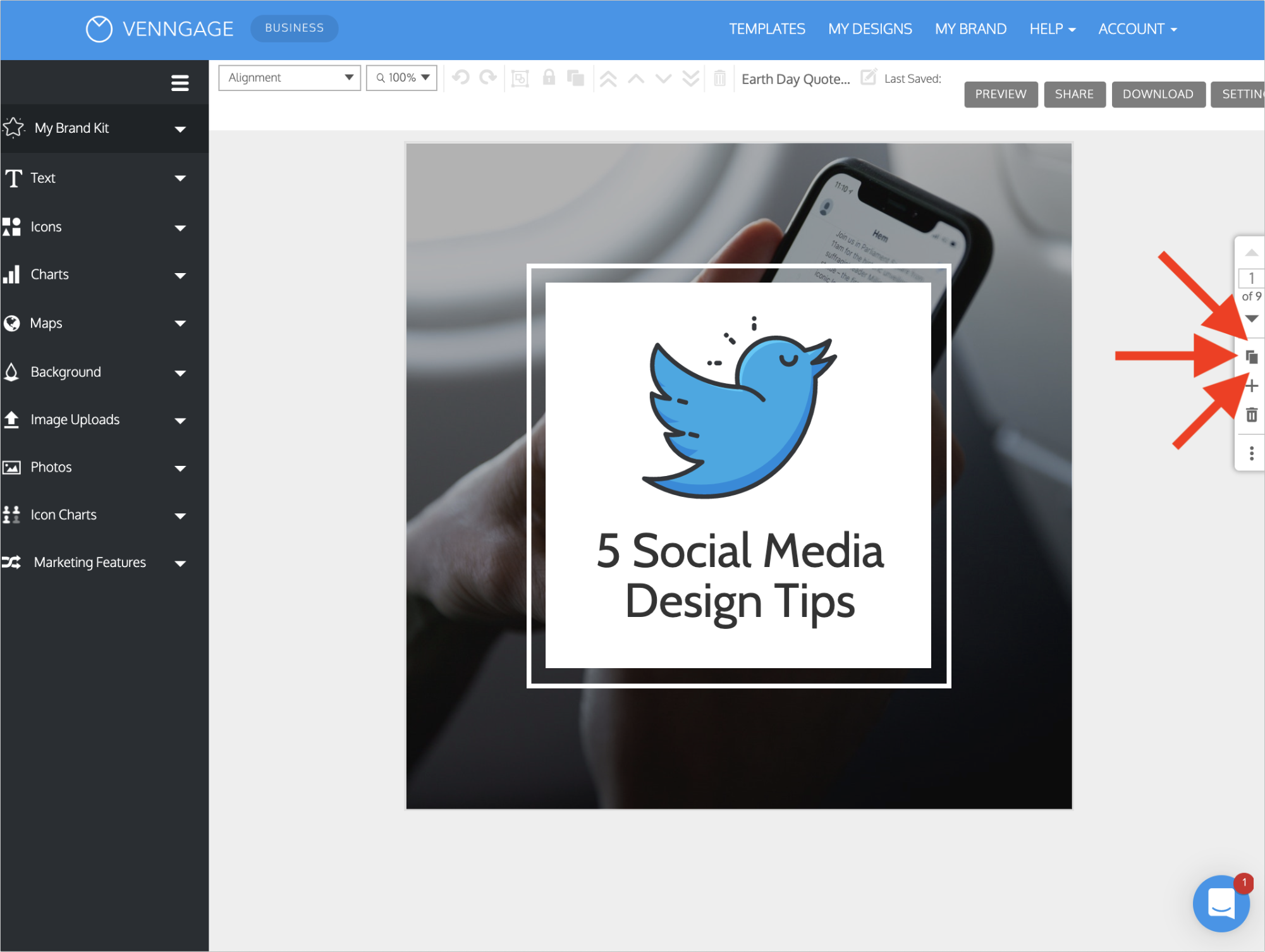
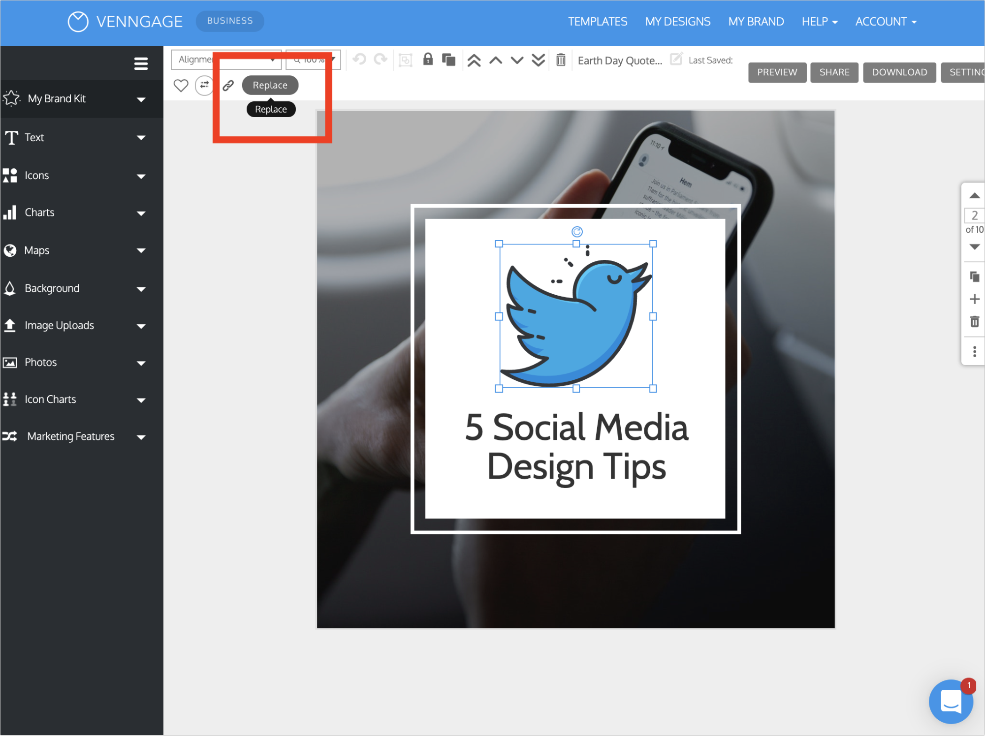
Now with a single click, you can swap an icon or add an image into the new slide by clicking Replace:
Once you click Replace a search box will pop up that allows you to swap the original icon with any icon in our library:
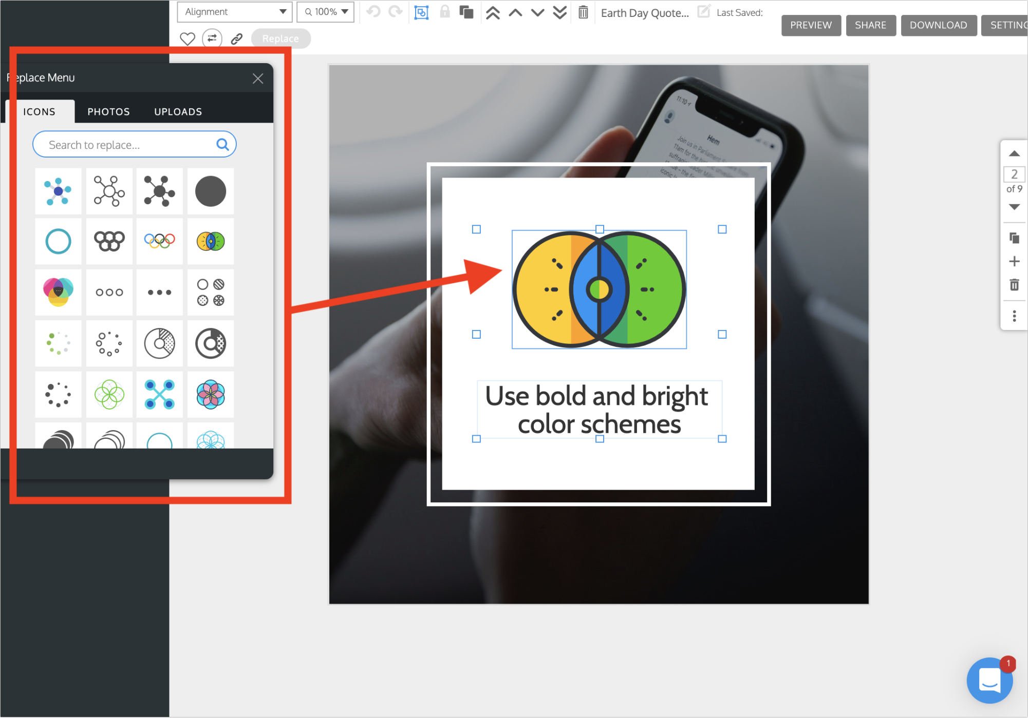
Pro tip: Use the same type of icon on each of your slides
Next, update the text on your slide with the next idea or point:
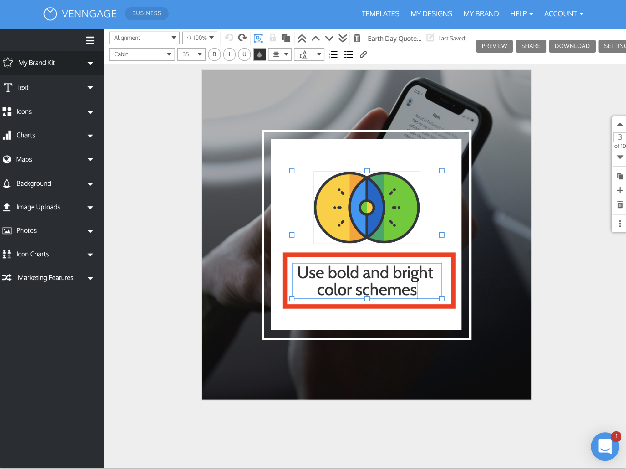
Remember, try to keep the text relatively succinct and use the icon to add extra context if needed.
Each slide should really only have one idea or piece point or piece of information as well. Otherwise, your presentation can turn into a jumbled mess pretty quickly.
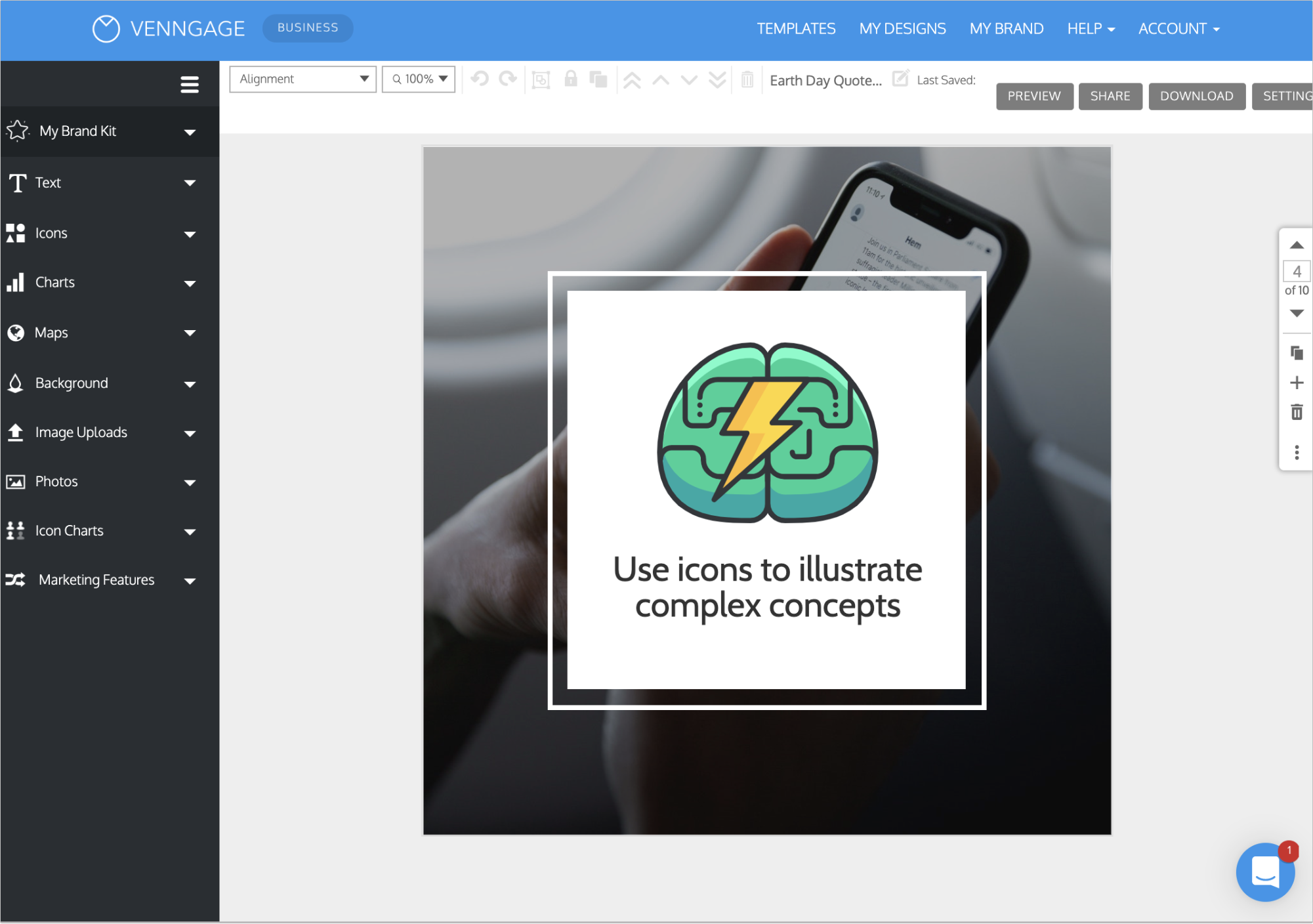
Once you knock out the first slide, just repeat the process above until you have created a whole slide deck!
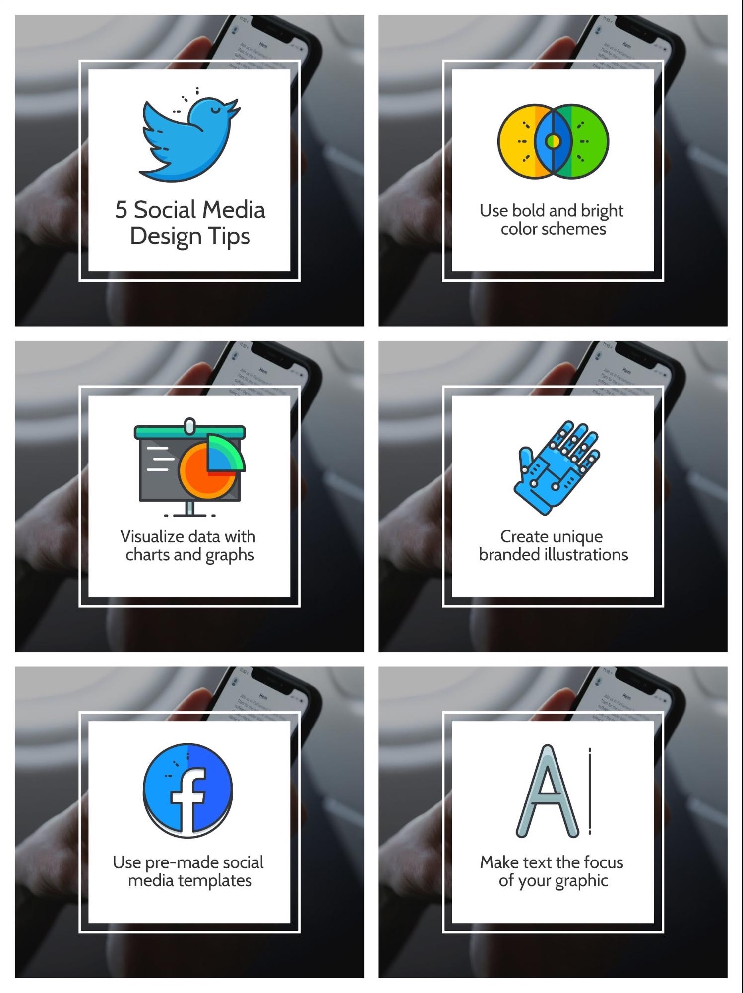
It’s really that simple! Most of the hard work was done in the first steps, to make the design work very quick and easy.
I know you probably want to jump right into the design work in the beginning, but following this process will help you create more impactful slide decks and presentations.
6. Download your presentation as a PDF
After you finish putting the finishing touches on your presentation, it’s time to share it with the world.
To make sure your presentation uploads correctly to LinkedIn you will need to download it as PDF.
Otherwise, you will only be able to upload one image as at time if downloaded as a PNG or JPEG.
So embrace the classic file format and download it with one click:
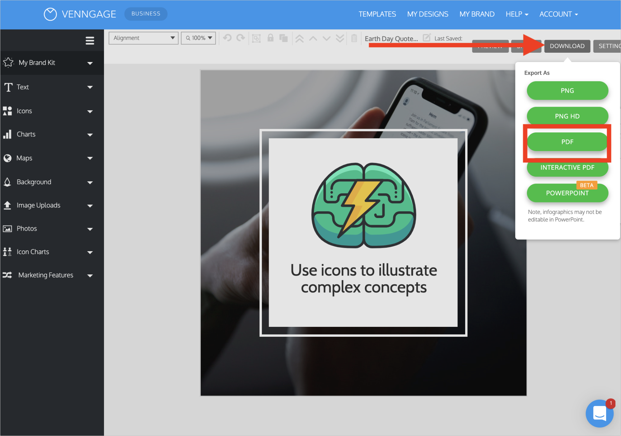
Once it downloads to your computer you’re ready to add it to LinkedIn!
Just like any other social share, you should include a descriptive caption and a few hashtags.
Including relevant hashtags will put your presentation in front of more people and sometimes you will trend for a certain hashtag!
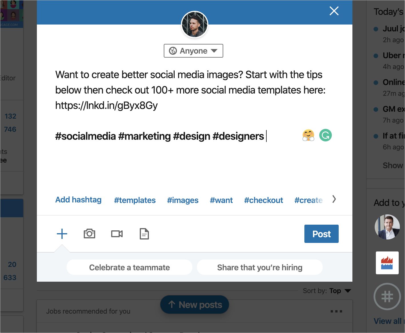
Also, make sure you link back to your blog post so that your followers can easily find the original content.
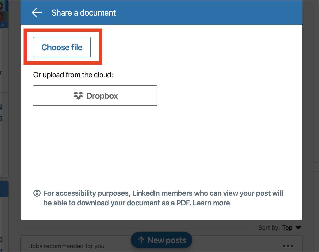
Next, instead of clicking the Camera icon, you need to click the Document icon to upload your presentation.
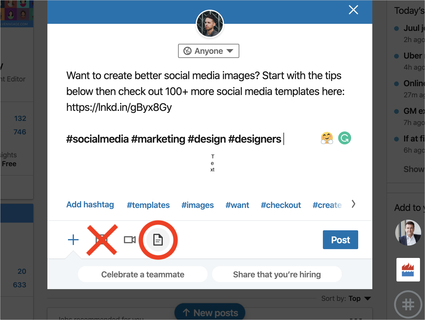
Uploading it as a document will ensure that people can scroll through your presentation and download it if they want.
Then click Choose file and simply drag and drop your presentation on the upload screen:
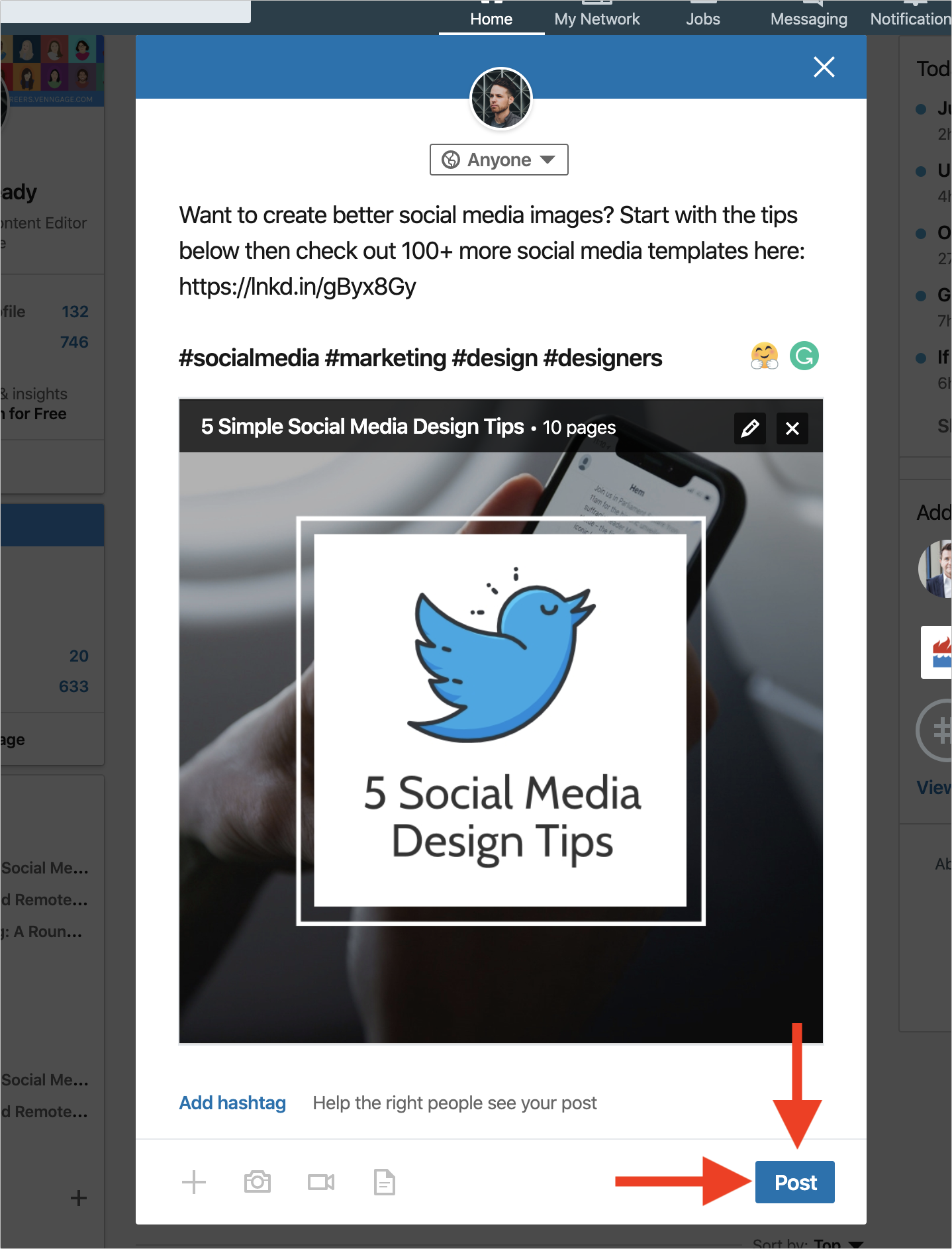
When the presentation uploads, you should add a descriptive title as well:

After you make sure everything is perfect, click Post to share your amazing presentation with the world!
And there you have it! We have covered how to create a LinkedIn presentation from beginning to end.
Hopefully with this simple process, you can create a ton of presentations and share them with your followers in no time.
If you have any questions, don’t hesitate to reach out to me on Twitter @RyanMcCready1 and be sure to check out all my presentations here!
