My old post on calls-to-action attracted a number of comments asking for advice on my readers’ current website design. I am not a professional web designer, so the only way I can find the best solution is by experimenting and testing.
Yet, effective conversion rate optimization can boost your revenue, so it is worth every effort!

So I decided to review two simple methods that can help you identify who and where clicks your call-to-action button.
Different types of CTAs
Calls-to-action may be different, including:
- Buy now buttons
- Subscribe for update
- Exit popups
- Two-step opt-in links, etc.
Make sure to play with different types and measure your ROI!
Further reading: How to Write a Call-to-Action: Wondering What to Put on Your CTA Button? Download Dozens of Ideas!
What encourages your visitors to act?
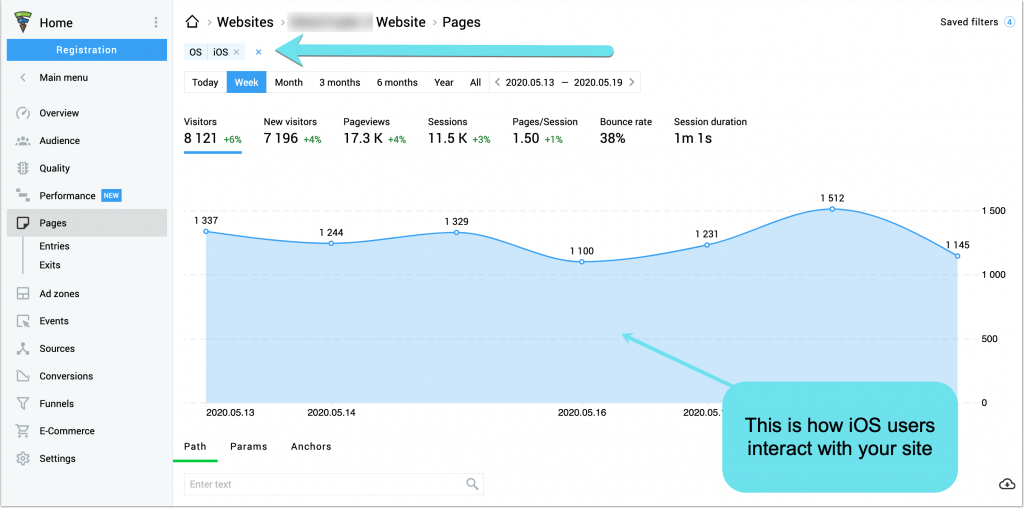
Finteza offers a variety of ways to monitor your calls-to-action, which paths lead your site users to perform an action and which CTAs are more effective than others.

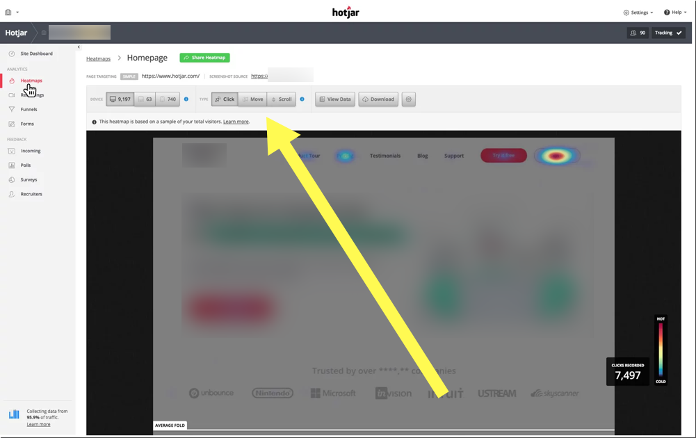
While Finteza is great at showing the path that brings your visitors to the goal (content and internal structure analysis), the heat/ click maps can show you which visual elements of your design attract more clicks.

I’ve been doing this quick test with CrazyEgg: the ‘hotter’ the spot looks, the more links it has generated – as simple as that.
Well, assuming that the reason behind my blogging was not to find new clients, I am doing fairly well at attracting feed subscriptions with my ‘seasonal’ feed button (well, I should probably change it for something more spring-like soon).
If you are testing a blog (like me), don’t set the experiment length to more than 1000 clicks. With each new post (and hence the home page look change), the heatmap can also slightly change. For example, with my previous test when the top post contained a black-and-white image, the click rate to the post link was considerably lower – instead people clicked at the ‘free SEO consultation’ link and feed button.
Who acts where?
Crazy Egg has another useful feature worth playing with: confetti. The beauty of this statistics is that you can learn your heat map based on the referrer. What can (probably) interest my friends who come to my blog from Moz? That be (1) my profile, (2) my feed, and my content.
Again, for more accurate results you will have to run a few short tests and compare. These tips won’t provide you with the exact picture of your visitors’ behavior (like any other statistics, heatmaps and Google analytics are subject to generalization and missing some important variables, for example Crazy Egg does not show the world map stats and there is no way to filter my own IP address – and I am guilty of visiting my own blog a few times a day 🙂 ) but they offer you the way to see what works and how to make it work better.
Overall heatmaps provide all sorts of insights:
1. Click maps visualize which links and buttons attract most clicks. These are great to analyze whether your CTA or a banner attracts most on-page interactions (clicks).
2. Move maps visualize where desktop users move and pause their mouse. These could be used to identify parts of the page that distract your users from your main CTAs.
3. Scroll maps visualize how many people scroll down to any point on the page. This is perfect if you want to see how deep into your long-form content your readers tend to get.
Here are you go: These are two simple ways to monitor your CTAs and how your site visitors are engaging with them.
