 A while ago I posted an article on color branding categorizing some general color symbolism theory. It resulted in a discussion over at SU where I was (fairly enough) criticized for looking only at one side of the medal. Really color perception differs from country to country and from niche to niche. Color theory deserves the whole separate blog to cover it and I outlined only some main points. Well, these comments encouraged me to look further into the topic and while it isn’t directly related to SEO or social media I regularly cover, I figured color in branding and web design is an interesting topic worth sharing with my readers.
Color branding: geographic targeting
Color symbolism is very area specific. Color associations vary depending on the national history, traditions and religion. Here is a popular example demonstrating the importance of color research before targeting a new area: when United Airlines expanded the service to Tokyo, their brand color was white. But the company had soon to change it to red, because in Japan, white can be associated with death and mourning.
However not everything is that simple, even within one country one and the same color may evoke quite opposing associations (see ‘red’ that can have both positive and negative associations of courage and sin in the USA).
| COLOR | East | Europe |
| Green | sunrise, life and growth (China) color of eternal life (Japan) sickness and/or nausea |
fertility and rebirth=> hope |
| Red | expelling demons and illness (Japan) fire =>honor, success, fortune, fertility, happiness; weddings (China) |
guilt or sin; courage and sacrifice |
| Yellow | royalty and respect (China) | jaundice and cowardice in Greece and jealousy in French culture |
| Pink | pornography (Japan) | baby girls |
| Black | nobility, age, and experience (Japan) trust and high quality (China) |
mourning style and elegance |
| White | mourning and death | purity or innocence |
(Based on ‘Color Meanings Around the World‘ and Colour Journal)
There is no such a thing as ‘universal’ color. Even a positive color like green (associated with Nature and growth in most countries) may denote death in South America and countries with dense jungle areas.
The best (and proven) way to target a specific country is to use its national colors – that always evoke positive associations of something familiar and trustworthy. For example, in Argentina where beer is a very popular product, a company called Quilmes has quickly become #1 due to national color branding (compare) and a more successful Coca Colla competitor in Peru Inca Kola managed to outdo the universal monster only thanks to sticking to the country’s national palette.
Color branding: niche targeting
Color choice in your website or brand logo design may be determined by a niche you are targeting. Again, there is no clear line between using some specific color for a vertical worldwide. For an instance, ‘red’ associated with debt and crisis in the US (e.g. it denotes a drop in stock prices) and hence avoided in ‘finance’ niche, has quite opposite associations in Eastern Asia where it is used to denote a rise in stock prices.
| COLOR | Auto/Transport | Beauty | Business | Adult | Gambling |
| Blue | Yes (strong association with clean calm water) | Yes (security) | No (indicates lack of experience) | No (denotes calming tranquility) | |
| Green | No (unlucky color in Europe and US) | Yes (associated with nature, life and growth) | Yes (association with US dollars and safety) | ||
| Red | Yes (sexy, speedy, high-energy, and dynamic) | Yes (associated with energy) | No (associated with debt) | Yes (denotes sexuality; e.g. red-light district) | Yes (encourages people to take risks; also paired with yellow) |
| Yellow | Yes (associated with taxi or a school bus) | No (associated with dishonesty, cowardice, egoism, betrayal) |
No (associated with children) | Yes (when paired with red) | |
| Pink | Yes (cars for women) | Yes (associated with young girls and youth) | Yes (=feminine) | ||
| Black | Yes (denotes prestige and luxury (e.g. black limousines)) | No (associated with death) | Yes/No (denotes prosperity, e.g. “in the black” but has some clear associations with something ‘bad’ and ‘illegal’) | Yes (denotes sexuality) | Yes (associated with prosperity) |
(Based on ‘color meaning article’)
Color branding: mood
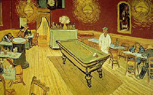
Colors and hues may create certain mood on a psychological level – this is most often a universal color effect used by prominent artists for a long time. The well-known master of playing with colors Vincent van Gogh said he didn’t like expressing what he saw directly, instead he used color to render the mood of the picture. Van Gogh’s painting The Night Café is the best example of the effect colors (and combination of colors) can make on a person:
‘In my picture of the Night Café, I have tried to express the idea that the café is a place where one can ruin oneself, go mad or commit a crime.’
Here is the painting (do you feel what the artist tried to express?):

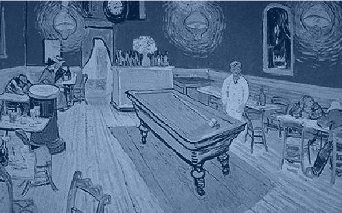
Now look what happens if we paint the same piece in blue:

See? There is no more depressing effect you might have felt with burning red and yellow contrasted to green hues. Blue instantly makes the atmosphere calming and refreshing. (You can try more color exercises here)
Some Fun?
Today as part of my traditional blog fun, I decided to share a few great color tools to play with.
- Create a color pattern (this seosmarty-header-like color pattern took me only 2 minutes to create):

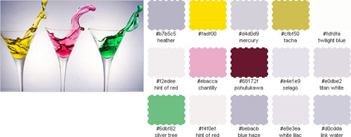
- Generate a color palette (very helpful when you want to create a design around an image):

This post is intended to be part of Graphic Design Group Writing Project.
Post image: Autumn
